History of iOS

With the recent release of iOS 14, the iPhone received some pretty cool additions like home screen widgets and pinned conversations, along with some overdue features like compact calls. To celebrate the 14th year of iOS, we’re going to take a look back at every single version to see just how far the operating system has come…
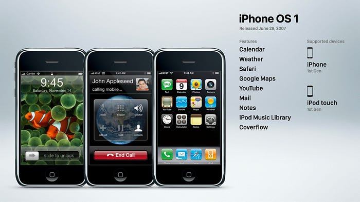
Let’s go back to when it all began in 2007, with the original release of iOS. Back then, things were quite a bit different. Apple didn’t even have a name for the iPhone’s operating system, they simply said it ran a version of Mac OS X. But once the second version was released, everyone began referring to the original as iPhone OS 1. So what were its headlining features? Well, Steve Jobs himself said the iPhone’s “killer app”, or the biggest attraction of the device, was its ability to make calls quickly and easily. Which is pretty funny considering making calls with our iPhones is something most of us try to avoid doing today. But back in 2007 the average smartphone like the blackberry was a headache to use, so being able to make a call in seconds was a huge improvement. Also, iPhone OS 1 had a built in, full featured iPod. That meant customer no longer had to spend $300 on a smartphone, then 200 more on a separate iPod, and carry around both devices. And like many other smartphones at the time, iPhone OS 1 included several apps like calendar, weather, safari, maps, youtube, mail, and notes.
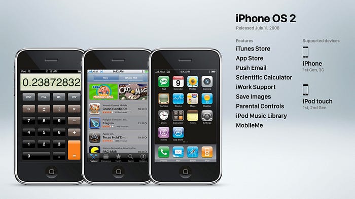
iPhone OS 2 come out a year later in 2008 and introduced the App Store, which is probably one of the biggest additions of any iOS release in history. The App Store completely changed the smartphone game. Allowing third party developers to create secure, optimized apps for the iPhone on a scale never seen before in the mobile device industry. iPhone OS 2 also featured the iTunes Store, a scientific calculator, which still exists today if you just rotate your phone, the ability to save images to the camera roll, push email, iWork support, and parental controls.
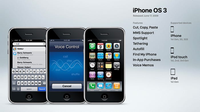
During this time jailbreaking became a widespread phenomenon since many users wanted convenient time saving features that Google was already implementing on Android before Apple, like cut, copy, and paste. While that feature did come to iPhone OS 3 in 2009, many users found themselves reaching the limitations of iPhone OS very quickly. Jailbreaking helped solve this issue by side-stepping Apple’s restrictions and allowing unauthorized features to be added to the operating system. It took Apple quite a while to implement features from the jailbreak community, a trend that would continue throughout the history of iOS. But as I mentioned, they did finally introduced cut, copy, paste in iPhone OS 3. Along with MMS support, spotlight search, tethering, autofill, find my iPhone, the controversial in app purchase capability, and voice memos.

In 2010 Apple officially changed the name of the iPhone’s operating system from iPhone OS to simply iOS since it was being used by other products like the iPad. iOS 4 introduced some crucial features like app folders, an app switcher, retina support for the new iPhone 4, game center, facetime, VPN support, orientation lock, iBooks, and perhaps one of the most long awaited features, custom home screen wallpaper. Which, for some reason, Apple waited three years to implement.
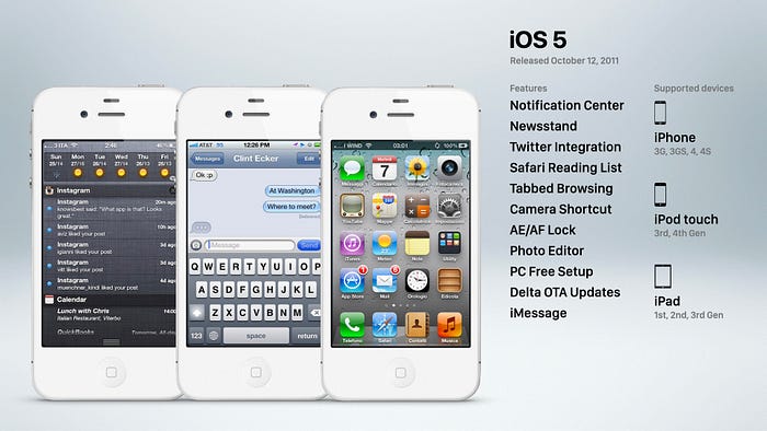
iOS 5 arrived in 2011, and represented a really significant advancement for the platform, since it finally allowed the iPhone to operate independent of a computer. Previously, users had to plug their iPhones to a Mac or PC in order to activate it and set everything up. This was very similar to how iPods operated, but iOS 5 elevated iPhone from being a companion device, to a standalone product. This version also featured notification center, newsstand which was later removed, tabbed browsing, the lock screen camera shortcut, and delta over the air updates. Siri was also part of iOS 5, but initially only available on the iPhone 4s.

An improved Siri came to other models with iOS 6, and introduced panorama photos, passbook, and do not disturb mode. This version of iOS was one of the most controversial ever, and that was for two reasons: Apple removing the native YouTube app, and replacing the native Google Maps app with their own version. You see, Apple and Google weren’t on the friendliest of terms in 2012 compared to 2007, since iOS and Android were fierce competitors by that time… And maybe because Steve Jobs said he’d spend every last penny of Apple’s cash to destroy Android since he considered it a stolen product.
So needless to say, Apple and Google didn’t renew their initial five-year agreement to continue including YouTube and Google Maps on iOS. Apple had to introduce their own maps app, likely much earlier than they anticipated, and it was nothing short of a disaster. There were endless memes created of Apple Maps poor renders and inaccurate directions. The app received so much criticism that Tim Cook publicly apologized and recommended using third party apps like Waze. This apology was not only a divisive move in the tech community, but also within Apple’s own leadership. Scott Forstall, Apple’s vice president of iPhone Software, was one of the people who felt Apple had nothing to apologize for. He refused to sign Tim Cook’s apology letter, and was forced out of the company less than a month later.

Craig Federighi took over as head of iOS development, and Jonathan Ive expanded his hardware design role to include software also. This had a huge impact on the following iOS release. Because while Scott Forstall was a big believer in skeuomorphic user interfaces, Jonathan Ive and his team believed in removing as many unnecessary elements as possible, leaving the software to exist in its purest form. iOS 7 was proof that Ive was taking the operating system in a completely new direction. With a flat, colorful interface that used parallax effects to establish depth instead of shadows, reflections, and texture. Now, I said iOS 6 was controversial, but it paled in comparison to iOS 7. Its flat user interface was extremely polarizing, since some people thought it looked too much like Android.
Also, the icons were criticized for being too simple. So simple, in fact, they could be recreated using nothing but Microsoft Word. The bright colorful gradients used throughout the OS were blinding to some users too. And perhaps worst of all, the parallax effect used to create depth could actually cause people to feel nauseous and dizzy. That’s why Apple added the reduce motion option in settings. So while the interface was iOS 7’s most dramatic change, there were also important new features like control center, airdrop, and dynamic wallpaper.
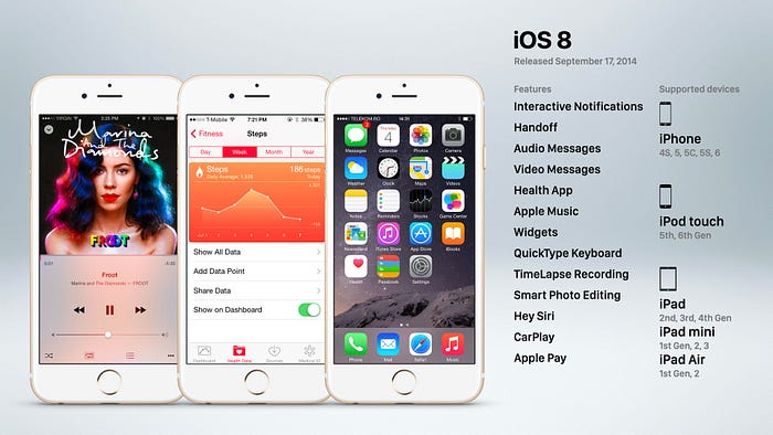
After a couple years of divisive iOS releases, things settled down a little with iOS 8 in 2014. It introduced some highly-requested features like interactive notifications, audio and video messages, widgets, a QuickType keyboard, time-lapse recording, voice activated Siri, and Apple pay. This was also the year when Apple released their much anticipated Apple Music streaming service, and introduced Car Play along with the Health app.
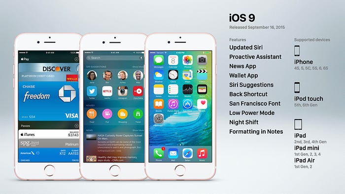
iOS 9 in 2015 was a more modest update featuring a refined Siri, the news app, the wallet app which replaced passbook, a new system font cal San Fransisco, low power mode, night shift, and 3D Touch support for the new iPhone 6s.
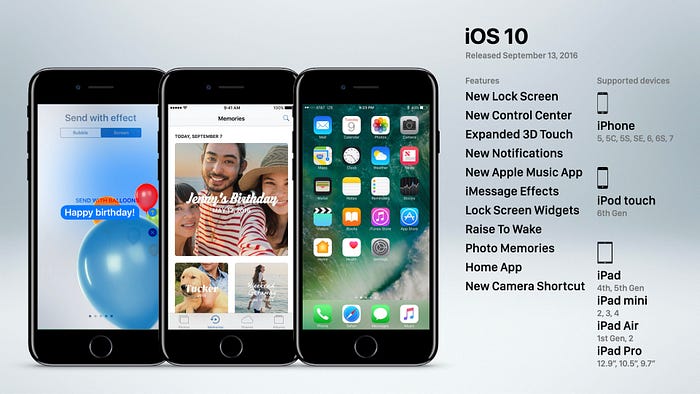
The following year Apple began refining the iPhone’s user interface with iOS 10. It featured a redesigned lock screen and control center, plus redesigned notifications. There were even more 3D Touch capabilities added, effects were brought to iMessage, you could raise your iPhone to wake it up, and the home app was added to control smart products like bulbs or thermostats.
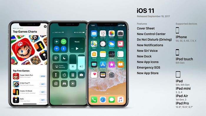
iOS 11 was released in 2017 and focused on refinements rather than new features. Control center, notifications, Siri, the dock, and the App Store were all updated, along with a few brand new features like Do Not Disturb while driving and Emergency SOS.
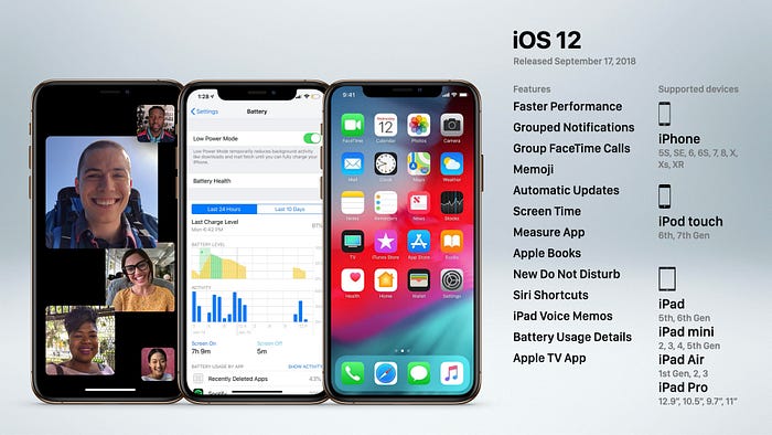
iOS 12 added grouped notifications, group facetime calls, memoji, screen time, the measure app, Siri shortcuts, battery usage details, and the Apple TV app.
In 2019 something really interesting happened that I think many people may not have noticed, but signified something really important about Apple’s hardware. Beginning with the iPhone 6s, Apple included 3D Touch hardware that allowed the device to sense pressure on the display, allowing for additional functionality like peak and pop, and app shortcuts. The technology originated on the Apple Watch in 2015, and 3D Touch was the headlining feature of iPhone 6s. But it had one fatal flaw, you couldn’t see it. Unlike the right click button on a mouse, 3D Touch was completely invisible and difficult to discover since people rarely press firmly on their iPhone’s display. So as a result, it was rarely used, with most people not knowing the feature even existed.
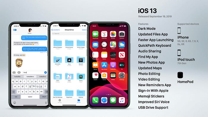
This was a huge problem since 3D Touch required an additional hardware component built into the display, which took up space and made the device thicker. So in iOS 13, Apple took a more sensible approach; Retain most of the features of 3D Touch, but make it entirely software based. They called this new feature Haptic Touch. It’s triggered by simply tapping and holding your finger on the display, instead of a hard press. That not only made it more intuitive for users, but also allowed Apple to remove hardware inside the display, which happened with the iPhone 11 and 11 Pro.
But iOS 13 featured more than just Haptic Touch, it also featured the highly anticipated dark mode, a QuickPath keyboard, audio sharing, advanced photo and video editing, sign-in with apple, Memoji stickers, and USB drive support.
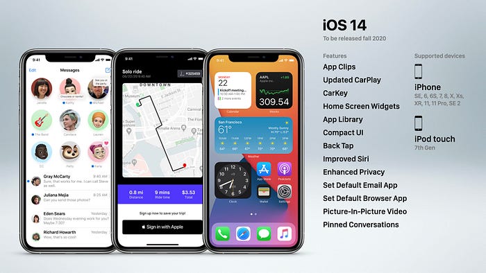
Lastly, iOS 14 was just recently released, and included some pretty cool additions. Like home screen widgets, app library, carkey, a compact UI for incoming calls and Siri, the ability to set a default email and browser app, back tap, picture in picture video, and pinned conversations.
